We all know how expensive it is to live in San Francisco, we know that gentrification is happening, but we don't have the exact geospatial evidence for this occurence in our colloquial discourse. Unless..., well, there is a map that aggregate the data for it.
Within this eviction mapping assignment, I want to understand why people live in San Francisco and the intensity in which gentrification manifests the time-space compression phenomenon for certain social and ethnic groups.
I made the map above to show the evictions in an increment over the years from 1997 to 2003, while at the same time showing that the evictions are more concentrated at the tech shuttle stops, where there is a high numnber of renters. In an Arcade issue San Francisco Tech Bus Stops, Displacement, and Architectures of Racial Capitalism, findings show that "69% of no-fault evictions occurred within four block of tech bus stops", where the primary affected populations are Hispanics and Blacks.
Additionally, the aggregated data shows that evictions peaked at 1999, what special event that happened then triggered this eviction outburst? Further research leads to the finding that there was a surge of 130,000 new tech jobs from 1999 to 2000 which immediately intensified the city's housing market shortage.
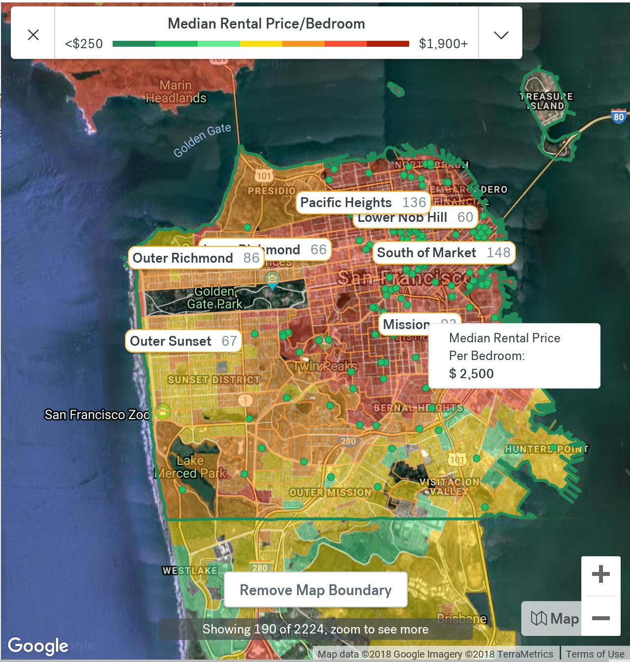
I decided that one Carto map is not enough to tell the story behind evictions in San Francisco. I made a second choropleth map of population of Hispanics classified by jenks since I'm interested in where the most and least percentages of this population is on the map. The analysis shows that Hispanic population is most concentrated in the Mission District, where the median rent is now at $2,500 per bedroom.
For design choices, the first map was a table join between SF tracts and SF tenure, styled by the value of number of renters. The tech shuttle stops are placed on the map as static red upside down teardrops to emphasis its existence among the the animated evictions over time. I used "xor" for blending because the it allows for both the source layer and the eviction points to be visible, more particularly it shows the source layer when the eviction points are cancelled out because they overlap each other. I used two widgets to show a histogram of the counted evictions, another widget for counted evictions in all zip codes of the city. I placed these widgets here so that the map can be as informative as well as engaging for the map viewers.
Where as gentrification is evident through the first and second chloropleth maps where places of high renters along tech shuttle stops, primarily in the Mission District with its majority of Hispanic population, the third map show evictions through the satellite base map. I think the satellite base map layered with eviction points viscerally shows how real these evictions are to others who do not reside within the city. I also included the popup feature in the third map to show the address and year for each eviction on the map. There is a fourth map that I found online while browsing for a more impartial representation of district borders of San Francisco.
This district map assists in analyzing the areas of significance, for example, The Financial District and South of Market (SoMa) are among the places with high renters and evictions because they are desirable and demanded social spaces.
On a revelant topic of labor and social segregation, renters from the Mission Districtare not only predominantly Hispanics, they are are also historically the blue-collar workers of the city. They are the ones experiencing the negative effect of time-space compression. The social segregation is telling us that high-pay, young tech workers as the social group has more power relation to determine their mobility, or where they live, work, move, as defined by Doreen Massay as "flows and movement", versus a social group who is "effectively imprisioned" by it, has to accept their designated, evictions or alienated spaces.
Although San Francisco is eating its own tail by evicting their longtime residents, and making room for the vanguard of tech residents, these evictions also brought together groups and coalitions standing up against their displacement. Narratives from populations of Latinos, Salvadorans, Nicaraguan, Vietnamese, Chinese, Japanese,are what shaped the struggles in San Francisco, historically, socially, culturally today.
In Pictures of a Gone City: Tech and the Dark Side of Prosperity, Richard Walker, a professor emeritus of Geography at UC Berkeley, exposes the wealth inequality that this time-space compression effect has become apparent in the form of evictions and many more, a Marxist concept of "all that is solid melts into air".